Chartreuse! Neon purple! Electric blue!
Sometimes rooms require a splash of color—or perhaps a client will want a particularly brazen color incorporated into their décor. Either way, using a vibrant color can be a design-do or design-don’t, depending on how it’s used. We hit up several Kansas City designers to ask the question: “What’s the brightest/boldest color you’ve ever used?”
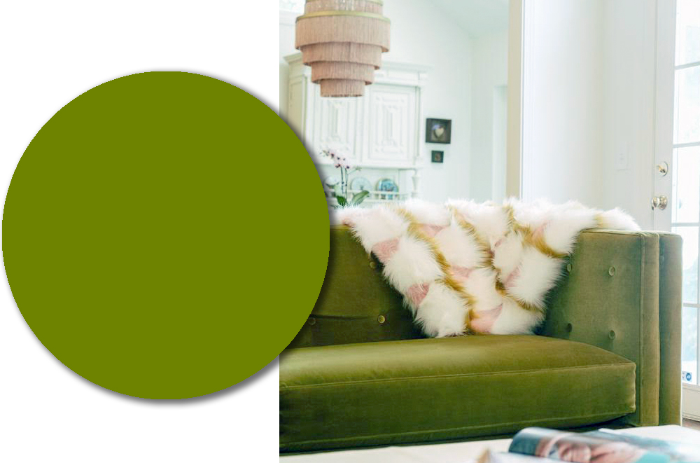
Sublime Lime: “I love this custom sofa because it is 70s chic! I paired it with a muted rug, soft pink ceiling and chandelier because I think green and pink naturally work together. I chose neutral wall colors to highlight my collection of local and regional artists.”
Morgan Georgie & Carrie Kiefer, Ampersand Design Studio
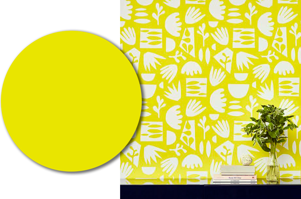
Hello Yellow: “You came to the right people because we are not afraid of bright and bold color! A color we are continuing to see grow in popularity is yellow in all sorts of shades! So this sunshine-y yellow wallpaper is one sure way to guarantee not having a dull day. It would be perfect for a little nook or fun powder room. We say go for it!”
Jennifer Bertrand, Jennifer Bertrand Designs
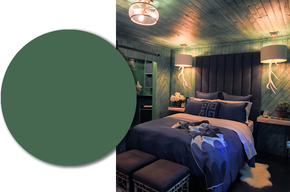
It’s Not Easy Bein’ Green: “I played off white shiplap wood, but of course, I wanted to take that trendy concept and turn it on its head. I actually won a national ‘sleep sanctuary’ contest for this design—a calming bedroom space. For me, green is calming. It’s a sprayed on custom stain. All good things in life are custom-made—and with a stain it allowed it to create more depth in the space.”
Kate Orscheln, Kate Orscheln Designs, LLC
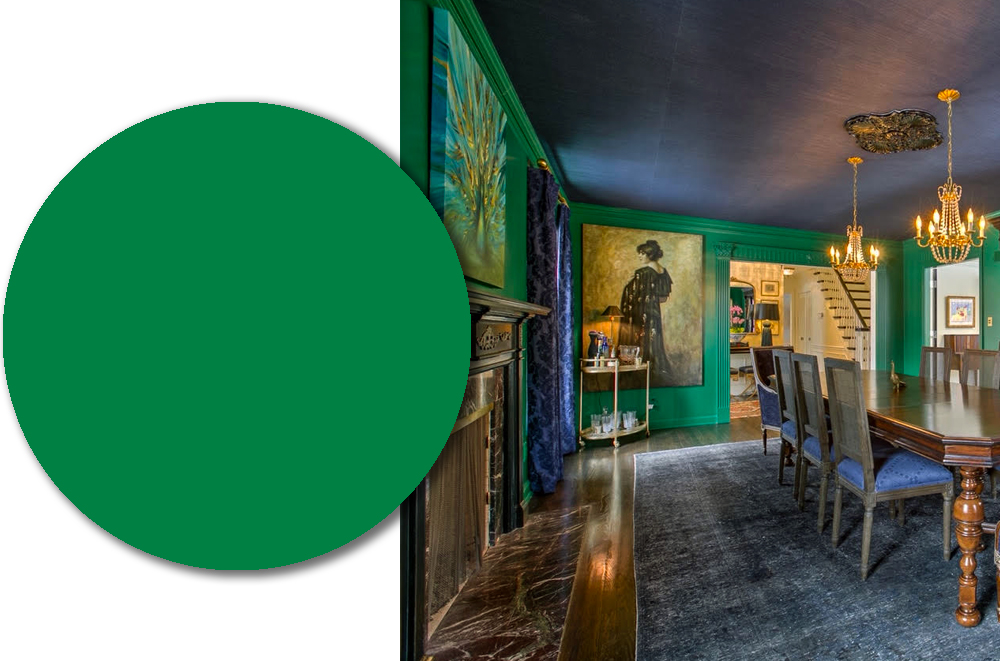
Emeralds Are Forever: “I love using color! It was my decision to use this bold, jewel-toned green in the dining room with navy sisal ceilings. My client let me roll with my vision. We wanted the dining room to be dramatic because the rest of the walls were painted white. My favorite thing to do is add detail to ceilings, because it’s such a fun and unexpected way to give a room personalitory. Even though I love to use bold colors, I am always intentional where they are used throughout the home. I think design should be fun and reflect an owner’s personalities and this particular project did just that!”
Lisa Schmitz, Lisa Schmitz Interior Design
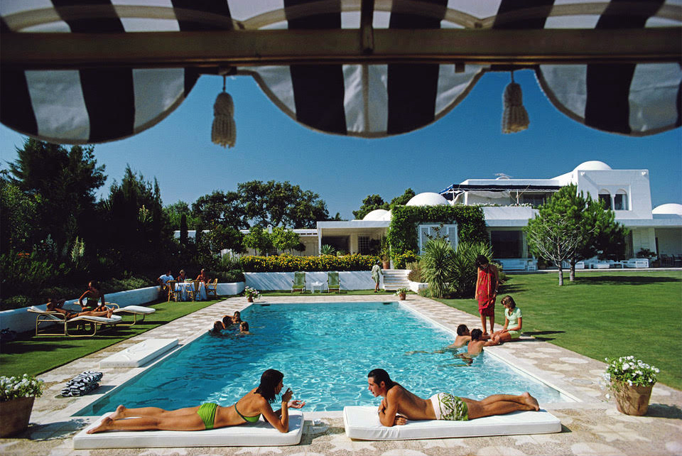
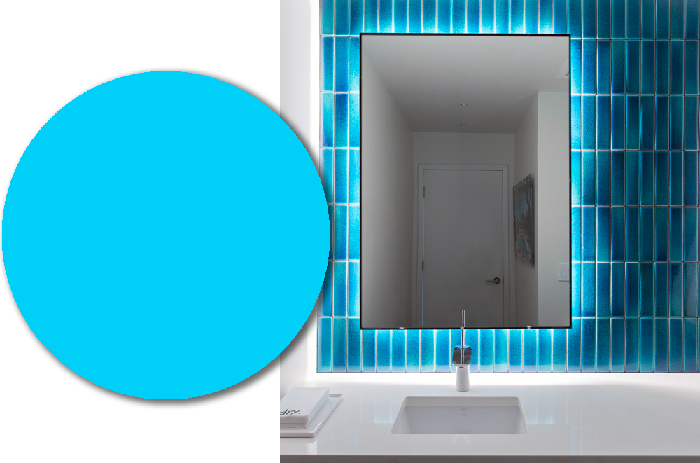
Poolside Punch: “In a home where ebony and white contrast a vibrant and colorful art collection, the powder room—a focal point from the entry—cried out for a punch of drama. Our client fell in love with a quirky Slim Aarons’ photograph (below), which hangs on an adjacent wall. The clear turquoise pool and bright blue sky inspired intense teal-glazed tile backsplash. Back-lighting the mirror intensifies the glow reminiscent of sunshine and pool days, which breaks up the crisp neutrality for a fun surprise.”