
Light or dark? Bright or muted? Primary or pastel? Orange or oranger? All of the above? None of the above?
When it comes to choosing a color palette or picking just the right color combo, sometimes the options can be overwhelming. We hit up some of Kansas City’s most innovative interior designers to find out what their top picks are when choosing the right two colors to adorn a room.
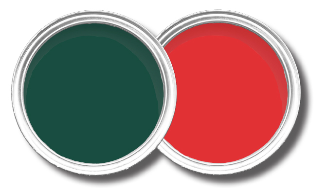
Jennifer Bertrand, Jennifer Bertrand Designs: “I adore unexpected pairings because—unless it’s a holiday—red and green is not a pairing people love to explore. However, I often remind them, that red and green is also a palette for old-school Gucci and that didn’t work out poorly for them! And keep in mind, painting a shade of green in your home is like having a plant you can never kill!”
Brand: Sherwin Williams
Name: SW6468-Hunt Club
Brand: Amy Howard
Name: Frankly Scarlet
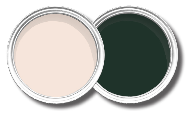
Sara Noble, Sara Noble Designs: “We saw green make a strong comeback at market. I love a dark, rich green that is balanced with a soft blush. The contrast of the masculine green, with the femininity of the pink, create an interesting balance.”
Brand: Benjamin Moore
Name: Pensacola Pink
Brand: Benjamin Moore
Name: Essex Green
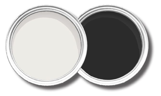
Buck Wimberly, Ulah: “When designing spaces for my clients, I often look for ways to add depth and dimension. One of my methods in achieving that is to add an element of white and an element of black. Snowbound is just warm enough to not look stark, but never looks pink or yellow. Tricorn Black, meanwhile, is the cleanest and most neutral black I’ve found because it doesn’t take on other hues (red, green, or blue).”
Brand: Sherwin-Williams
Name: SW 7004-Snowbound
Brand: Sherwin-Williams
Name: SW 6528-Tricorn Black
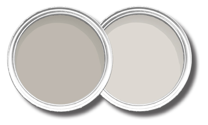
Patrick Madden, Madden-McFarland: “I have always been drawn to clean, monochromatic environments. I enjoy the serenity, simplicity and calmness that this aesthetics provides.”
Brand: Sherwin-Williams
Name: SW7016-Mindful Gray
Brand: Sherwin-Williams
Name: SW9166-Drift of Mist
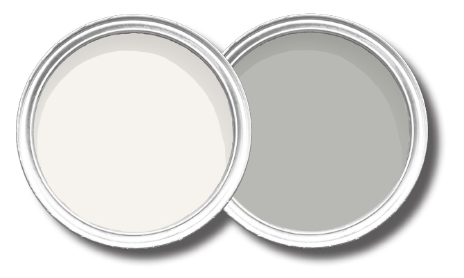
Karin Ross, Karin Ross Designs: “Both of these colors are crisp and represent the trends of today—but without the cold/too modern feel. In fact you can see a gentle underhue of beige in both colors, which works perfectly for clients that refuse to convert 100 percent to gray. For the walls? Sonic Silver. For trim? Whisper White.”
Brand: Behr
Name: Whisper White
Brand: Behr
Name: Sonic Silver
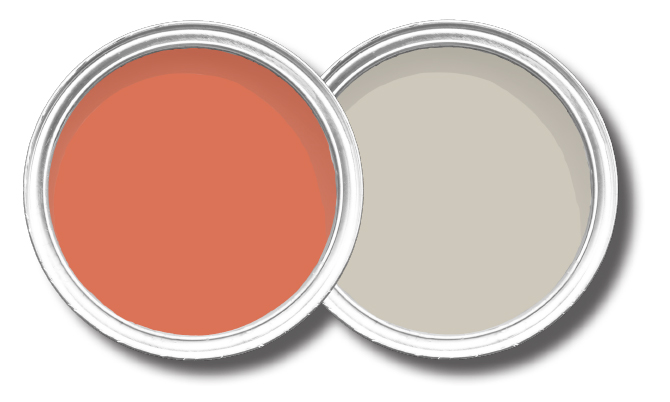
Teisha Barber, Jackson | Main Architecture: “I have a favorite color combo that I gravitate towards using for various clients and even in my own home. I love to start with Benjamin Moore’s Revere Pewter. It is a perfect mix of gray and beige and it does shift one direction or the other, depending on the light in your space and the natural light you have coming in.”
Brand: Benjamin Moore
Name: 028-Rich Coral
Brand: Benamin Moore
Name: HC-172-Revere Pewter