
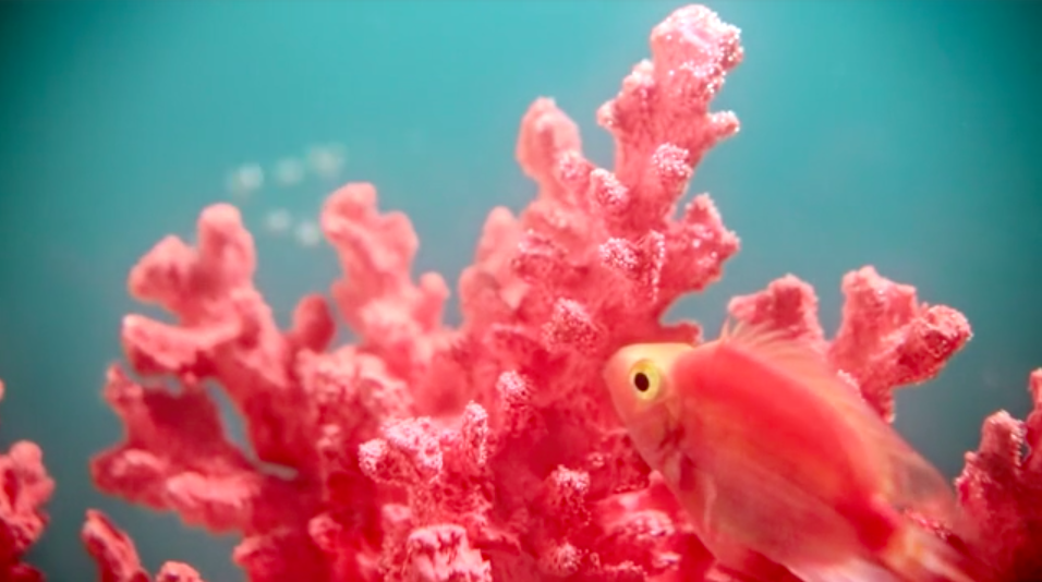
Whatever you do, people—do NOT call it salmon. Pantone just unleashed their Color of the Year for 2019. It’s, well, in a pastel tone: PANTONE 16-1546 Living Coral. Art directors, graphic artists, and interior designers all over the world are either 1) ooooh-ing and aaaah-ing or 2) losing their ever-lovin’ minds. There’s likely no middle ground.
Pantone says: “Living Coral embraces us with warmth and nourishment to provide comfort and buoyancy in our continually shifting environment.”
Think pink, indeed!
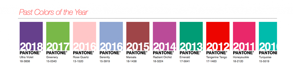
For 20 years, Pantone’s Color of the Year has helped to influence everything from product development to purchasing decisions in multiple industries. It crops up in fashion, home furnishings, and industrial design, as well as product, packaging, and graphic design. Turns out, Pantone’s color experts at the Pantone Color Institute comb the world looking for new color influences. (Who knew?)

We hope you’re ready for coral—sorry, living coral, people. It’s about to permeate your very soul. Or as Pantone says, it symbolizes “our innate need for optimism and joyful pursuits, PANTONE 16-1546 Living Coral embodies our desire for playful expression.” Alrighty then.
Again—just do not call it salmon.