
You’ve heard of classic colors—like beige, ivory, taupe, etc. But have you heard of “forever” colors? Neither had we until recently. Turns out designers typically have one particular shade in their artistic arsenal they faithfully use over and over again. Why? Because 1) it’s a creative staple and 2) they know it’s a color a client could enjoy, well, forever.
We touched base with several of our favorite local interior designers and artists to hear about their forever color and why it’s their signature, go-to choice.
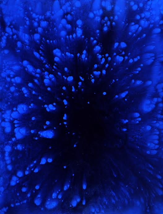
Blue is the forever color for New York artist and KC native Brady Legler. No other colors even come close he says. Every painting he creates has the color blue in it whether it is visible to the eye or not. “I will always think of blue as the healing color. It’s one of the miracles that saved my dad,” Legler says.
Legler’s blue story dates back to May 2003 when his father was diagnosed with one of the deadliest cancers in the world, anaplastic thyroid carcinoma. A doctor at Johns Hopkins gave him a slim hope for survival with experimental, twice-daily radiation treatments and chemotherapy. “My father prayed more than he ever had. One of those prayers may have brought him relief from an unexpected source: a neighbor who taught and practiced meditation,” Legler says. “She told him to imagine the cancer cells were turning blue and dissolving while he was receiving radiation.”
Blue became Legler’s father’s mantra during every session. His father survived, only one of a handful of survivors. “For me, blue means hope and optimism. It fuels my creativity, pushing me while it calms me,” says Legler. His favorite shades are azure, cerulean, ultramarine, and IKB (International Klein Blue). “Azure is the color of the sky on a clear day, cerulean is a shade darker, and ultramarine is the deepest, most healing shade to me because it reminds me of the ocean where life began.”
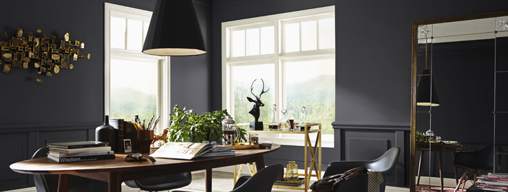
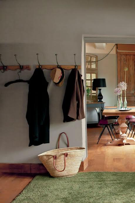
Seville Home’s Carrie McColgan is here to remind you that black is simply a perfect forever color. “Simply sophisticated. Demanding and bold. Incredibly versatile,” she says. “Black goes everywhere and can be creatively used in every room—in my opinion. It’s timeless and you will never tire of it.”
She has a few ideas up her sleeve: “Black kitchen cabinets allow sharp contrast when paired with light countertops and backsplash. Black interior trim is a bold detail move that pays off with anything-but-drab results. And for the truly adventurous? Black paint on a feature wall is just crazy-cool dramatic.”
A current trend in upholstery is to “go light and add strategic splashes of color,” she says. “Guess what? Black is a color and can satisfy your urge to splash! It’s about contrast and injecting a unique character into your favorite spaces.” Her fave shade is Sherwin-Willlams epic SW 6258 Tricorn Black.
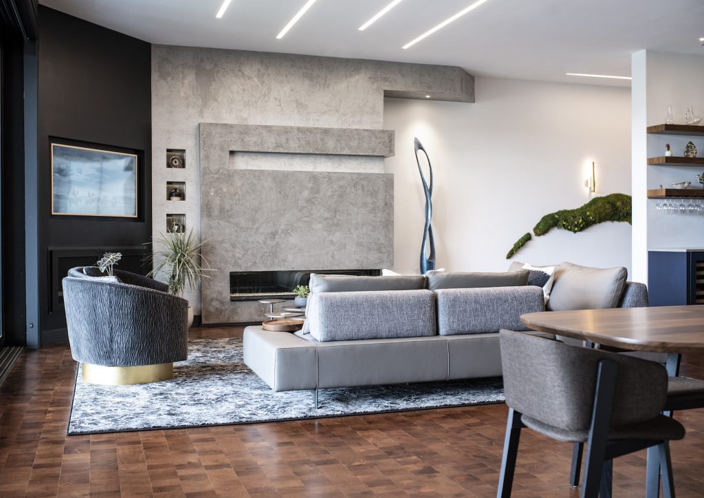
Ulah Interior + Designs’ Buck Wimberly is a fan of using a particular classic white when he’s designing a room. The color is anything but distracting and allows for other pieces in the room to take center stage.
“One of my favorite ‘forever’ colors that I often use is Sherwin Williams’ Snowbound, SW7004. I talk about it a lot because I use it often,” he says. “It’s a beautiful and timeless white that has the perfect amount of warmth.” Wimberly and his team use this color to modernize older traditional spaces and in newer modern environments. “It’s the perfect foundation to build off of, and complements almost any other color, material, or art you choose to accent the space with,” he says.
In the above photo, you’ll notice how Wimberly has used it throughout this modern high-end Capella condo in Prairie Village. “It runs throughout the space, creating the perfect quiet backdrop—allowing our custom-design work, unique furnishings, and the clients’ art to be the heroes of the story.”
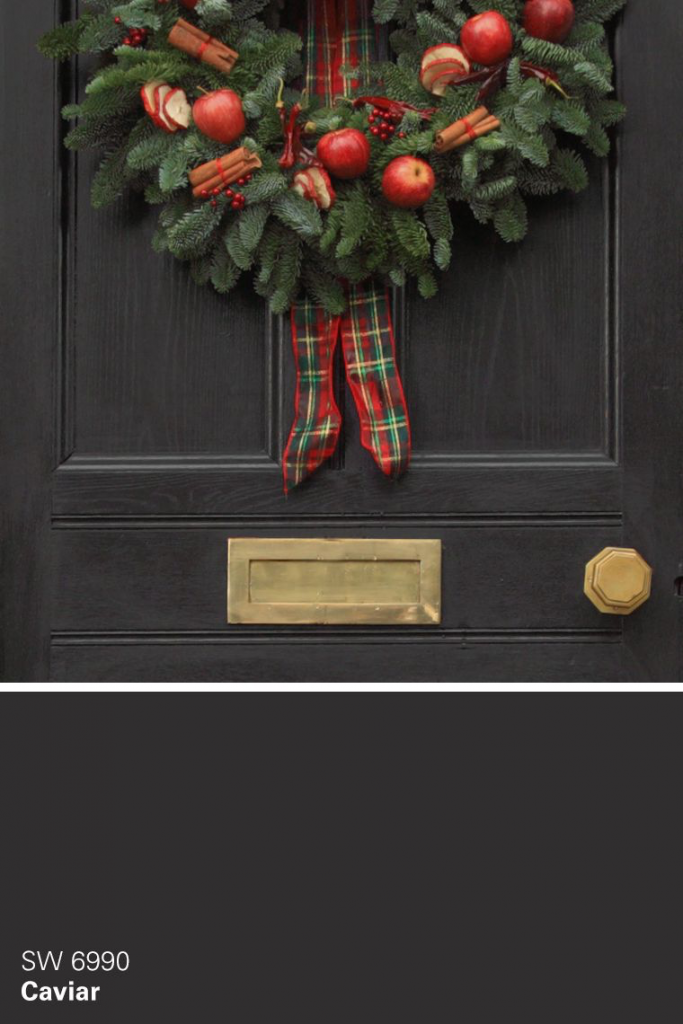
Decorator extraordinaire Jen Bertrand also chooses black for her forever color—specifically, a “rich, velvety black,” she says. Some might see the color as a bit macabre, but not the former Design Star winner. Given the opportunity, she’d “wrap the world in a velvet, lush blanket of black”—in fact, that’s the color she used for the exterior of Casa Bertrand.
“We used Sherwin-Williams Southwest Caviar on the outside of our house to make the Frankenstein architecture of our 1990s home elevate into a Cinderella-at-the-ball moment! Seriously, I adore it every single time I pull up. Why? I know that on the inside we are slowly playing with light and color—cleanly and simply.
“Our family pandemic self-care action was gardening—and every time we add another layer of color, that black backdrops those flowers perfectly.”
When it comes to Patrick Madden’s quintessential forever color, he wants something that “plays well with others in the sandbox.” He chose a non-assuming but—as he calls it—“strong and confident” shade of gray. Of course, we all know there are way more than 50 shades of gray. Good thing the Leawood-based Madden-McFarland Interiors’ buyer and ambassador of style could narrow it down for us a bit.
“I am hanging my hat on Farrow and Ball’s Charleston Grey #243. There is something special about the Farrow and Ball paints that has always been attractive,” he says. Madden says he appreciates the richness and depth of color that is produced from the rich pigment—chalk and China clay that has been used since the mid 1940s.
“Charleston Grey gives a soothing feel to any room, almost a softness or comfort—an ease and approachability. Not only does it seem to outlast trends, it allows itself to absorb other paint colors and acts as a perfect companion if you are using it as an accent color. You can’t go wrong,” he says. Color him a fan of the shade’s subtle earthy undertone. It’s a color that doesn’t “pigeonhole itself as traditional or a contemporary standby.”